The CSS Flexible Box Layout Module is an unofficial, still under development W3C specification created to support responsive layouts natively.
With this new specification, developers will be able to build responsive layouts without the help of complex CSS frontend and UI frameworks, with as little CSS code as possible.
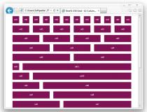
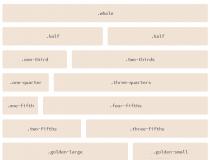
Flexbox Grid is a simple CSS-based grid, that instead of complex percentage calculations, columns, SCSS, SASS, or LESS, uses the CSS 3 flex property to manage the grid.
It works like regular grid systems, but instead of the CSS "width" property, it uses the "flex" one instead.
Lots of examples and usage instructions are included with the download package, just what you need to get started with using this new revolutionary CSS layout model.
What is new in this release:
- Replaces grid with container and container-fluid.
What is new in version 6.2.0:
- Replaces grid with container and container-fluid.
What is new in version 6.1.1:
- Replaces grid with container and container-fluid.
What is new in version 4.0.0:
- Updating API to match bootstrap grid.
What is new in version 3.0.0:
- Updating class names and removing gutters.
What is new in version 1.1.0:
- Updating to use calc for IE11 rounding differences.
What is new in version 1.0.0:
- First stable release.
What is new in version 0.2.0:
- Updated alignment API.
Requirements:
- CSS 3 enabled browser
תגובות לא נמצא